Put your hand up for a massive rebrand!
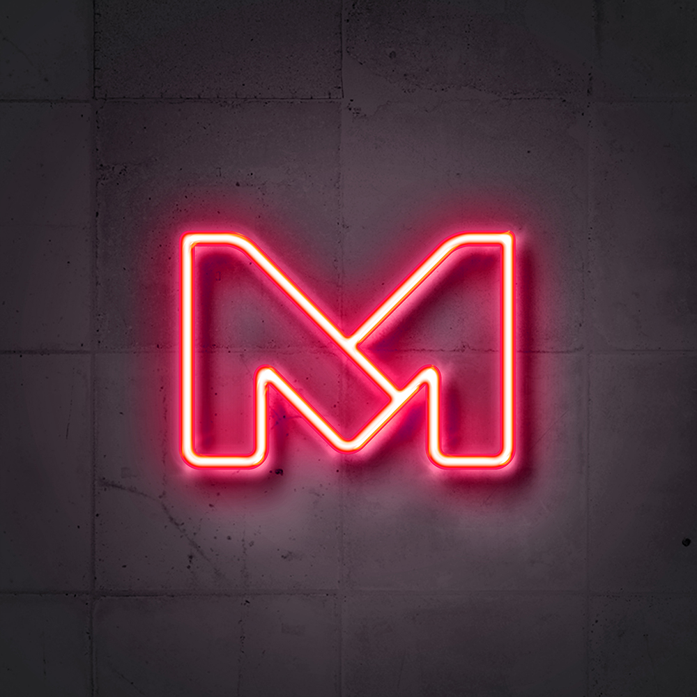
Client: Merch, s.r.o.
Rukahore (which means “put your hand up” in Slovak) is one of the biggest music-related e-commerce portals in the Czecho-Slovak market. The brand started as a music publisher primarily catering to rap artists, but now it has brought a large number of products and genres under one roof. Creating a more universal (yet not sterile) brand identity was the main objective for the client.
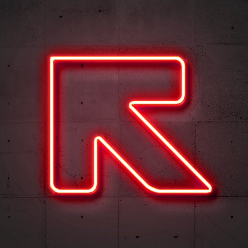
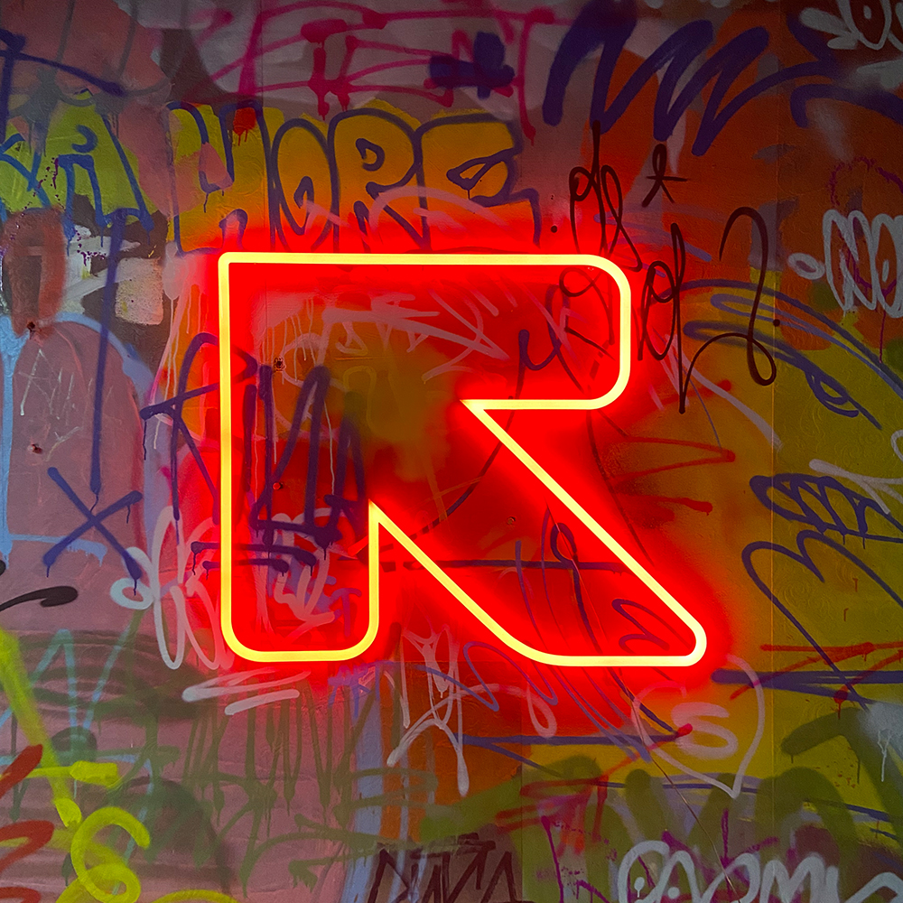
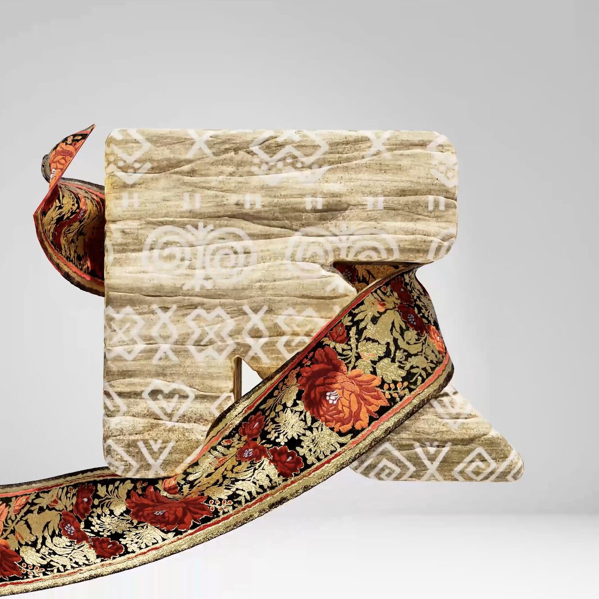
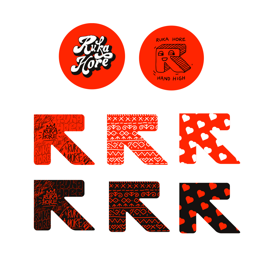
We understood from the beginning that the brand needed a simple yet strong symbol that could work on both a small and a large scale. The symbol needed to resemble the letter R and highlight the e-commerce nature of the brand. It needed to be a symbol that is simple enough to be re-imagined in any environment necessary to keep up with the demanding target group of the music industry.
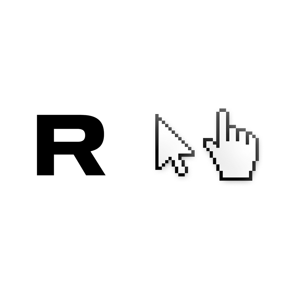
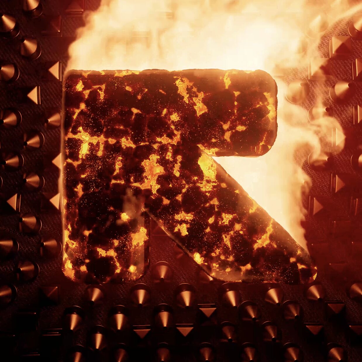
After a lot of trial and error, we came up with something wonderful — a giant arrow that is built on a simple grid and which is inspired by the letter R of the brand’s name and a mouse cursor.
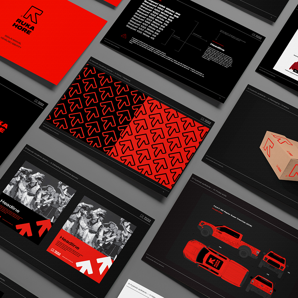
Consistency is crucial in branding — customers need to create a significant connection between communication and brand identity. They know from a distance which well-known brand a cup or a lollipop is from, and the same must work for the packages from Rukahore. We also agreed that the brand identity needed to be flexible enough for use in business, UI/UX, and other applications. It must also have the potential to be turned into rich visuals appealing to different audiences.
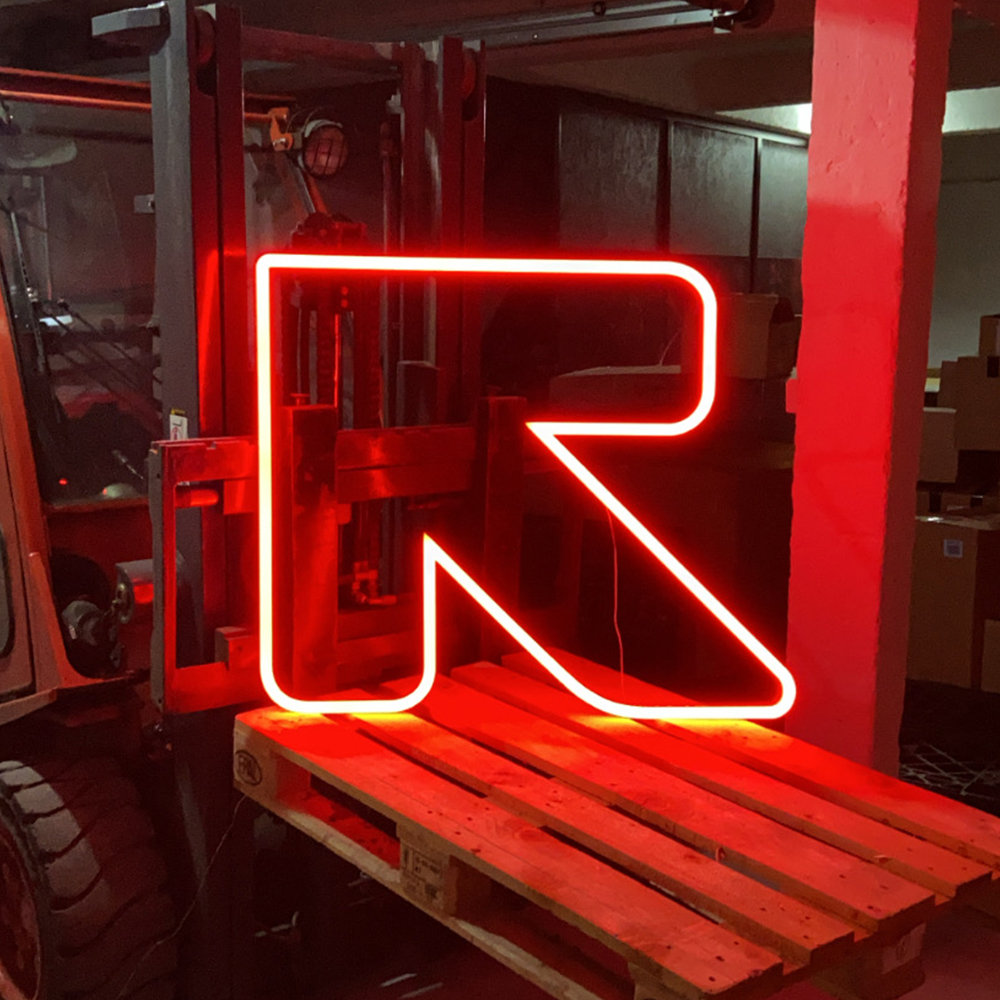
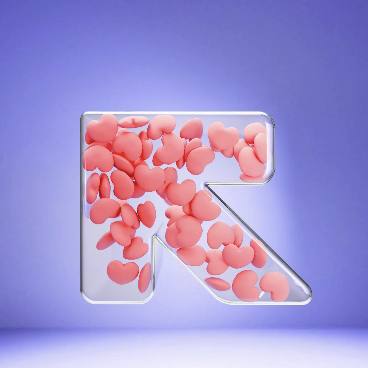
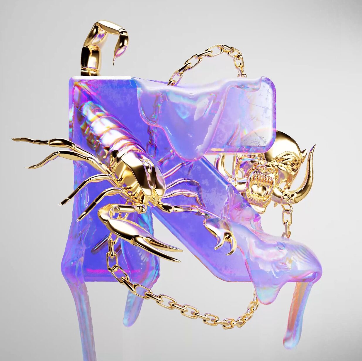
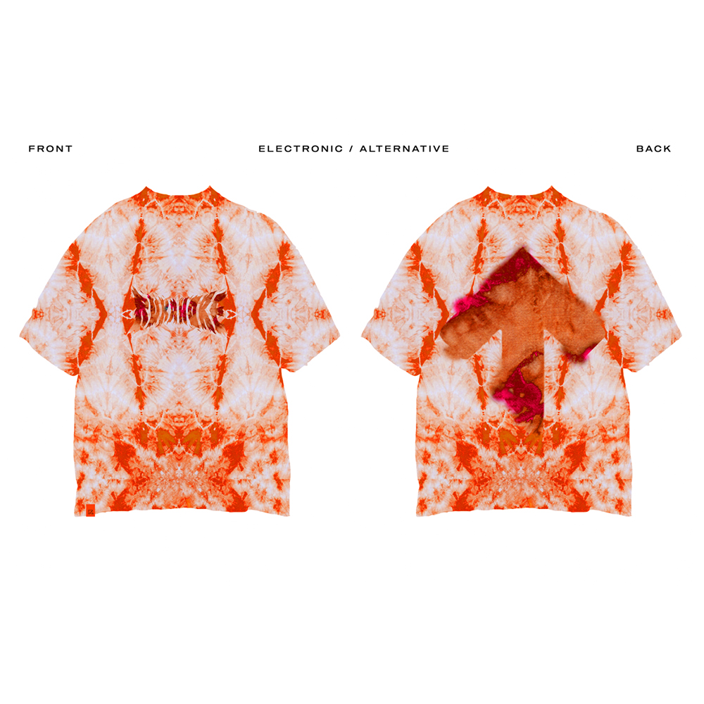
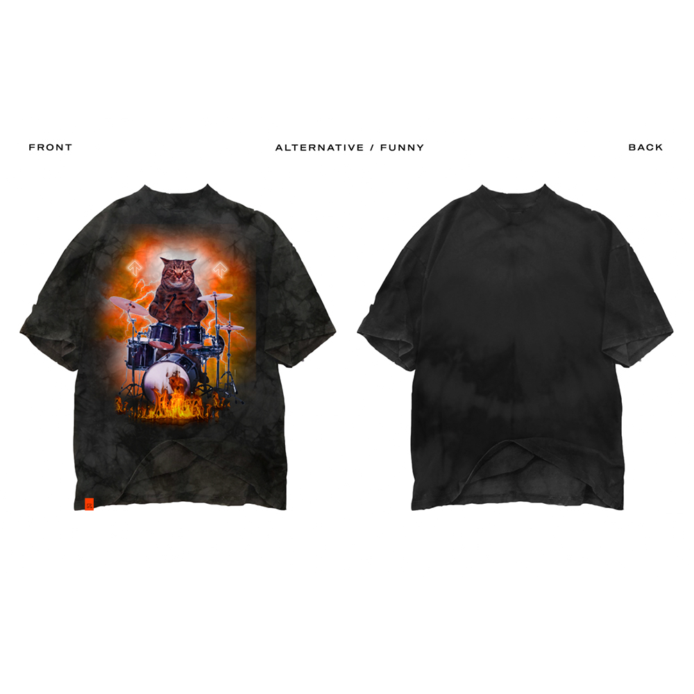
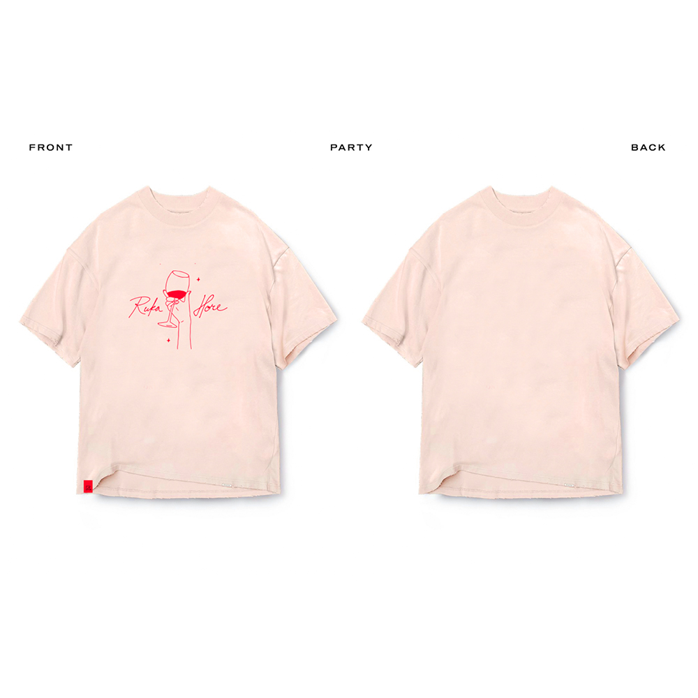
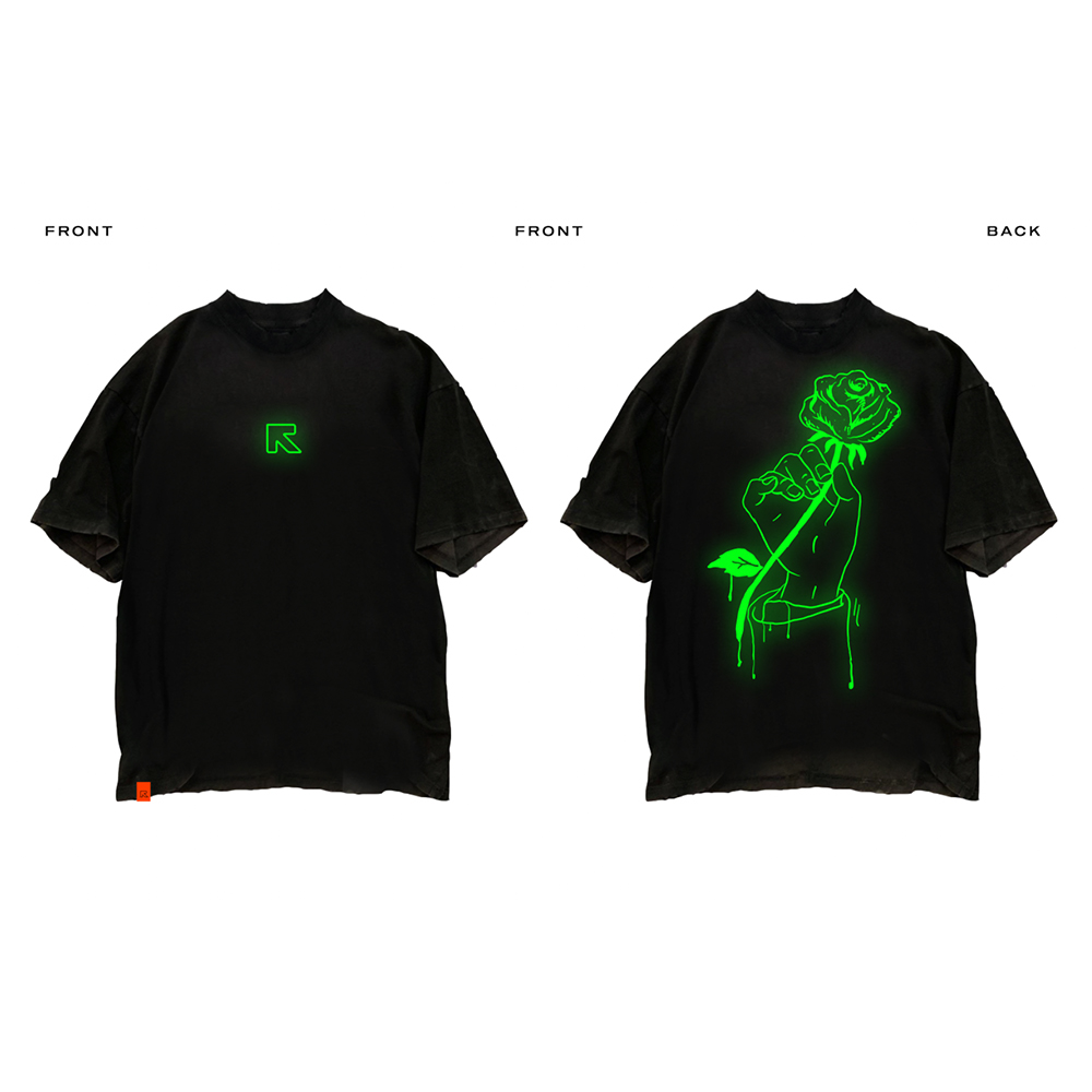
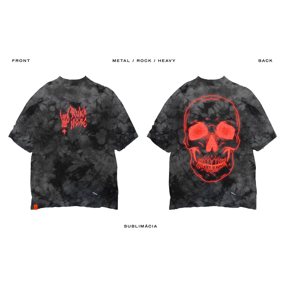
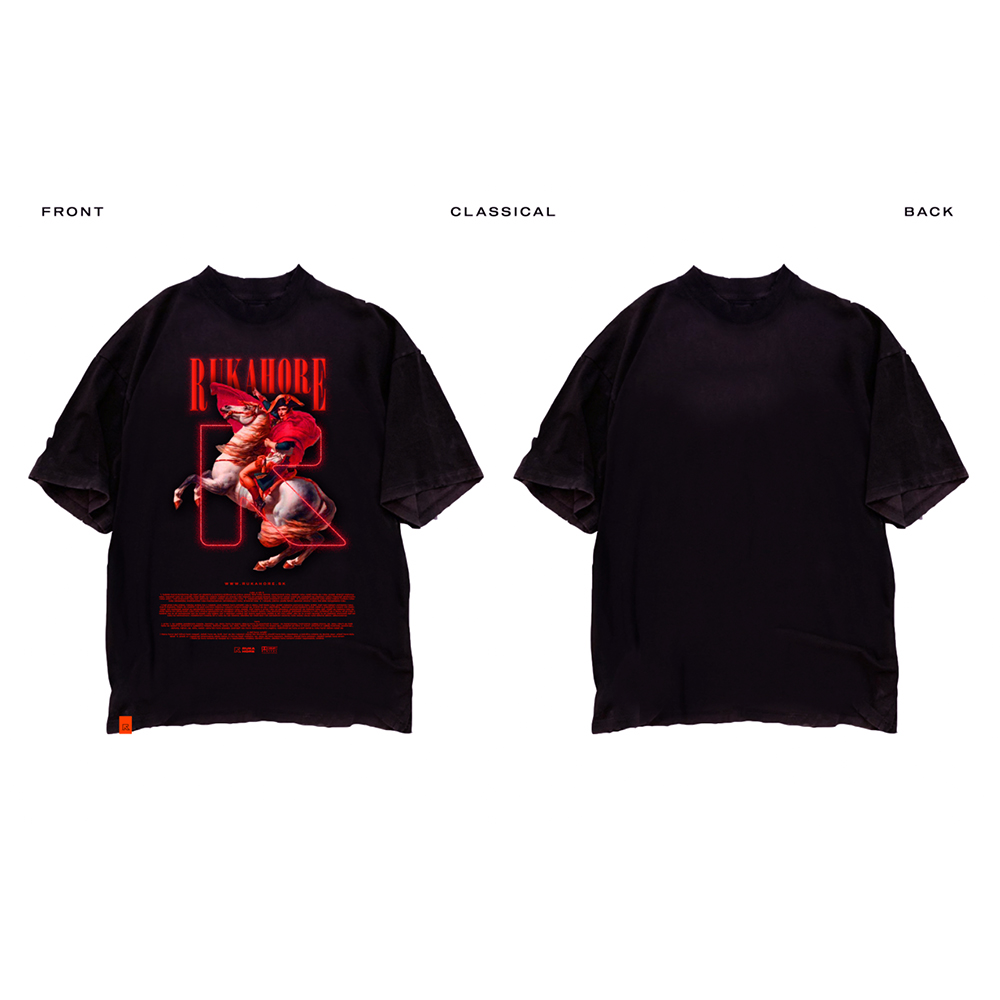
Our giant arrow can be anything we want — a doodle easily drawn by a child, epic 3D visuals, a small logo printed on a product, or in multiplied form as different patterns. It can be built easily in the real world, used as stencils, and even “made” of people as dancing choreography.
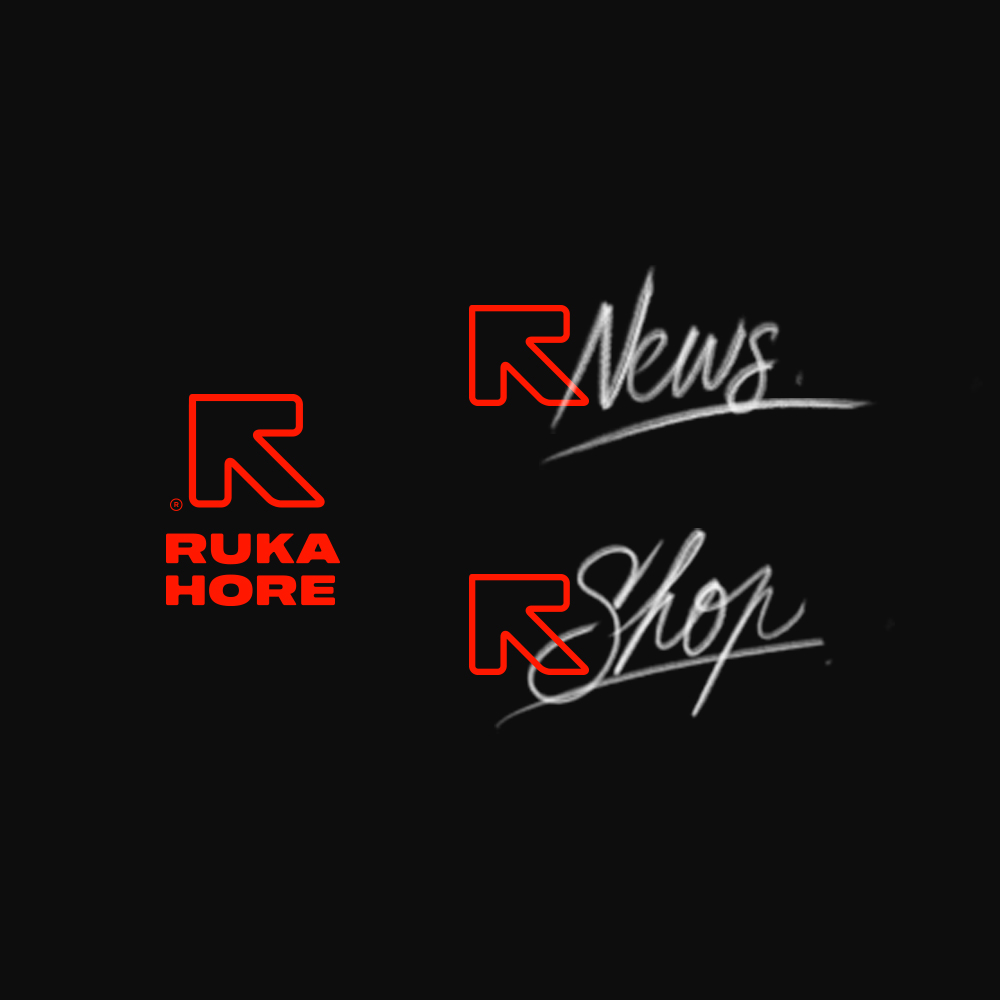
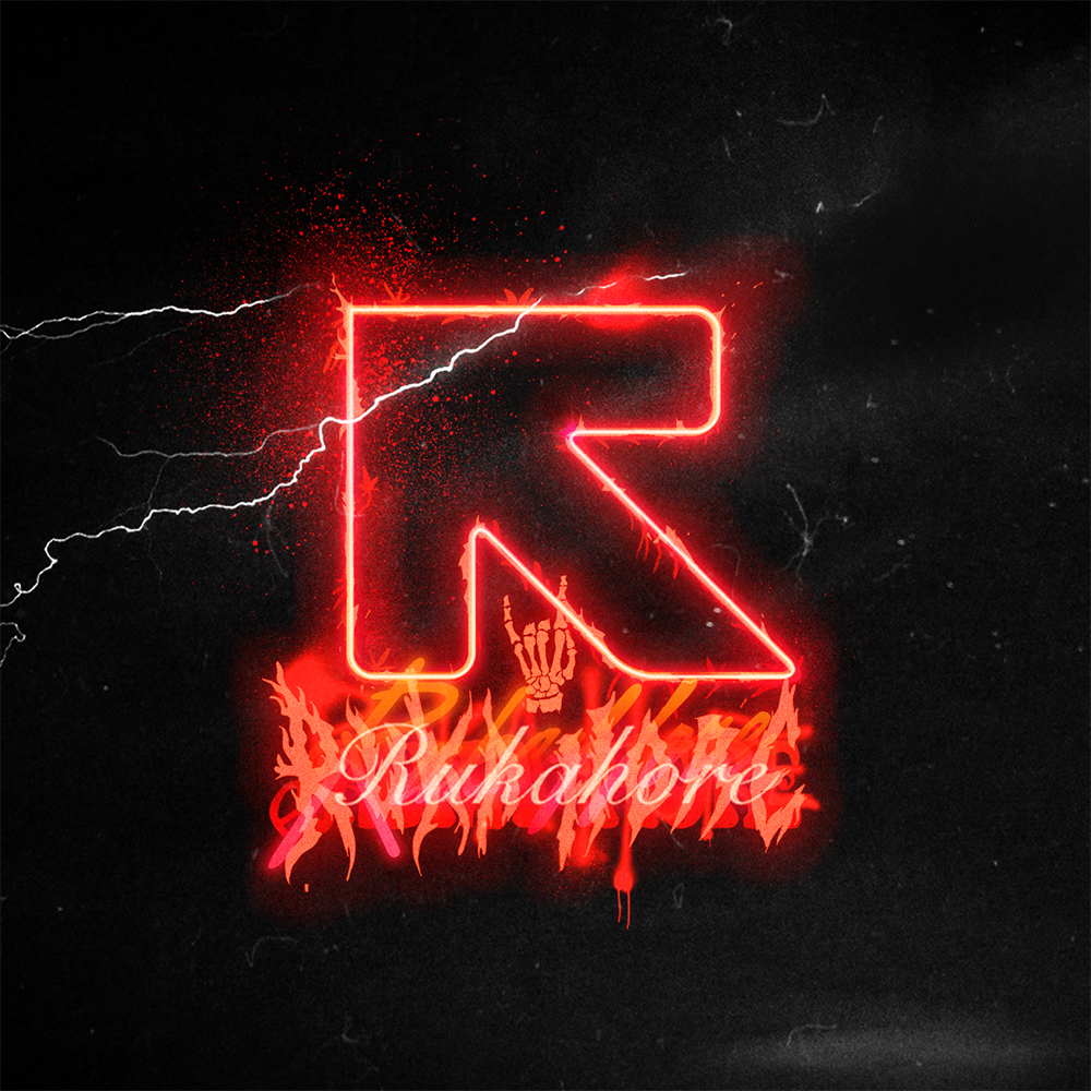
Used in 3D & 2D logo-idents, we can see the range of music genres the brand covers in their product portfolio.
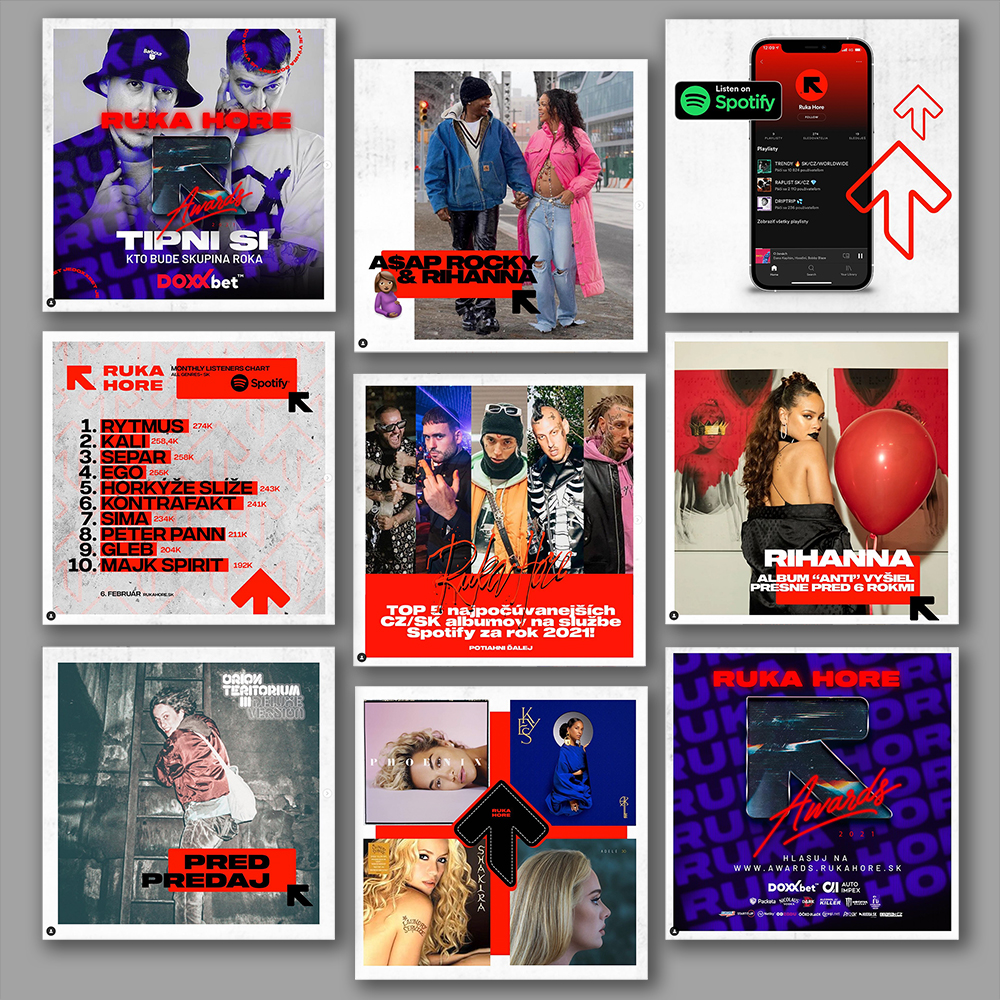
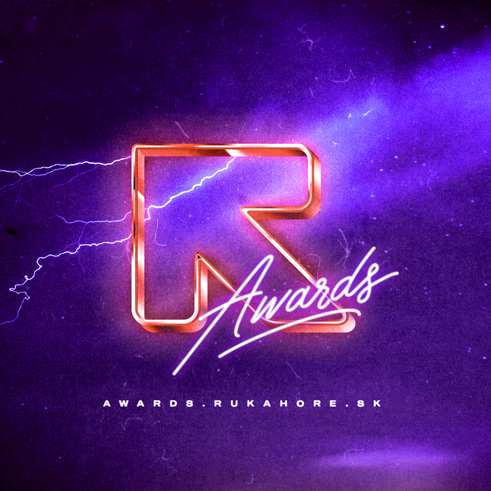
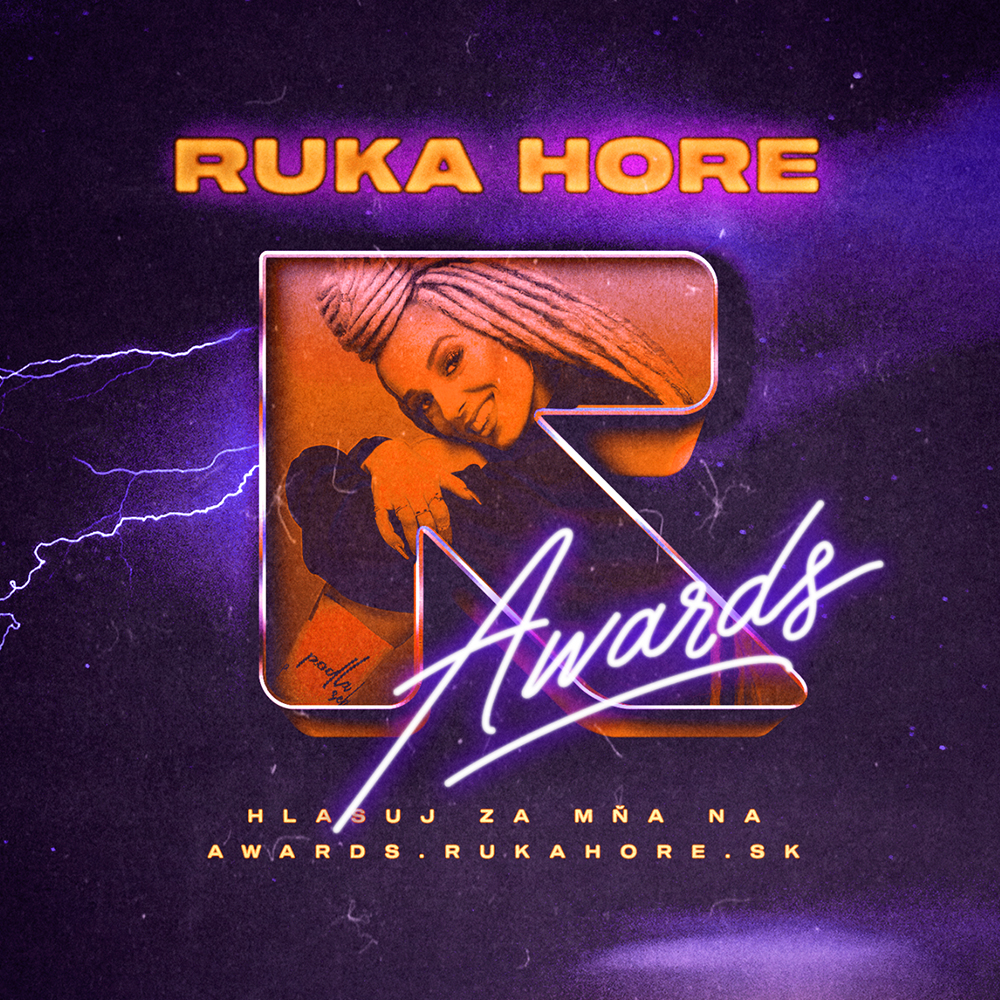
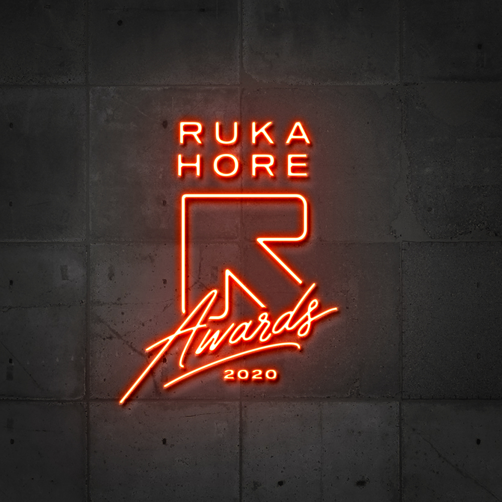
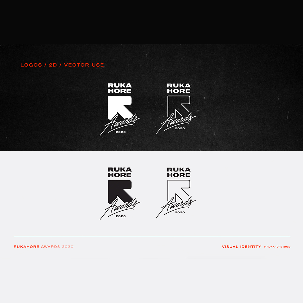
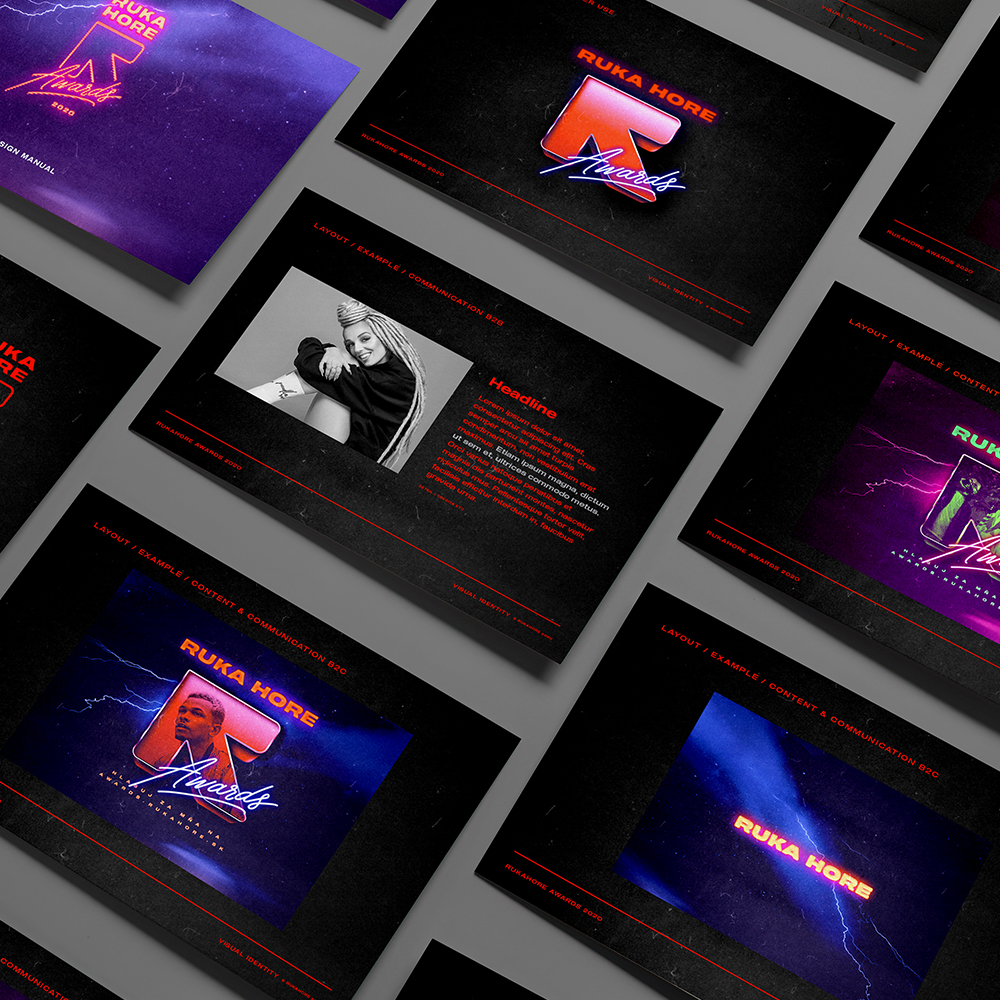
Another example of this flexibility can be seen in our next job for Rukahore, which was the visual identity for their Awards. This was a tool to support brand recognition, actively engage with the audience, and through participation (more than 60 thousand votes) announce the most popular artists.
The visuals are very contemporary with a special modern ''dirty'' flavour and other effects.
CREDITS:
ART DIRECTION, IDEA, STRATEGY, DESIGN: PAVOL BARTOŠ
DESIGN: MARTIN KLEMENTIS, IVAN VAJDA, TOMÁŠ ONDRÁŠEK
VIDEOGRAPHY: ANDREJ IŠTOK
MOTION DESIGN: MARTIN FERENC
3D VFX: DÁVID ŠANDRIK
MUSIC & SOUND DESIGN: JURAJ LIŠKA
Selected Works
Bratiska B2BProject type
NeovizeProject type
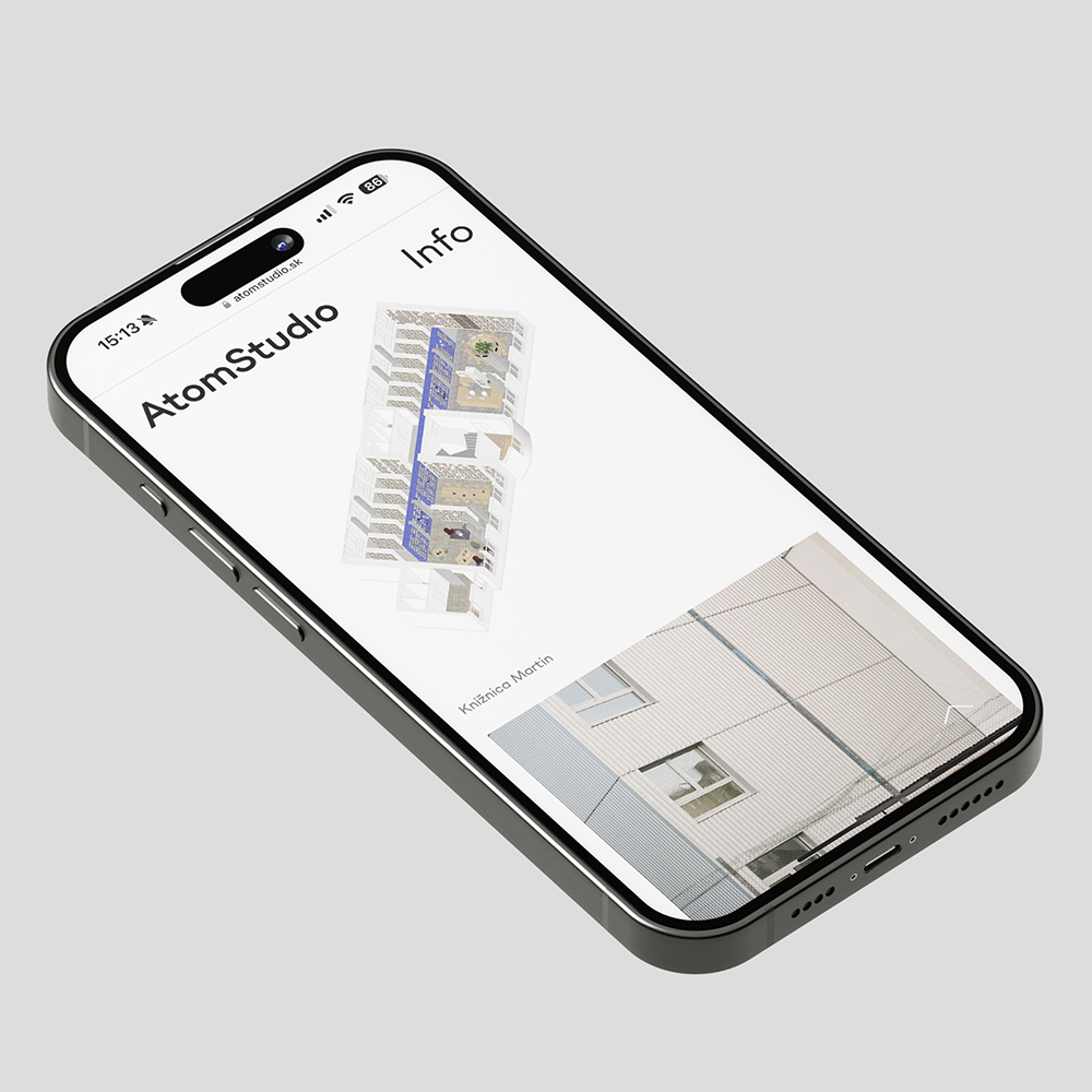
AtomStudioProject type

MartDentProject type
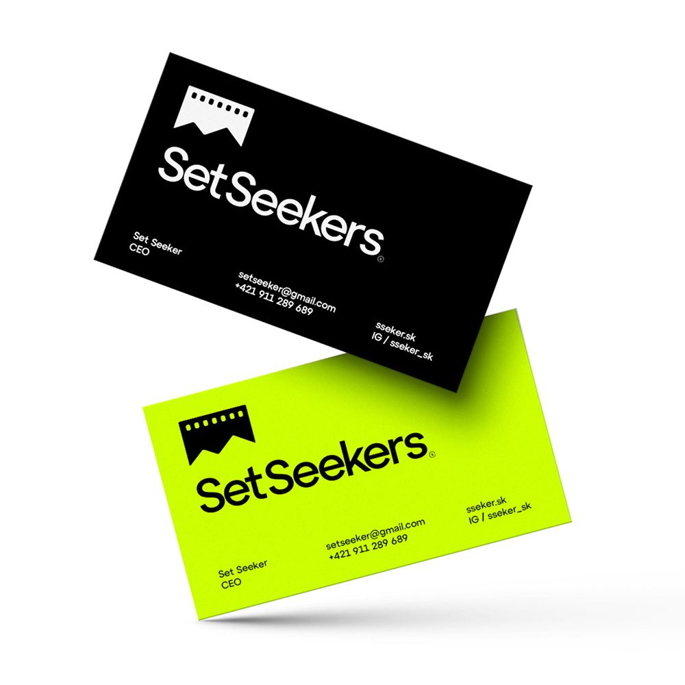
SetSeekersProject type
Wood Real EstateProject type
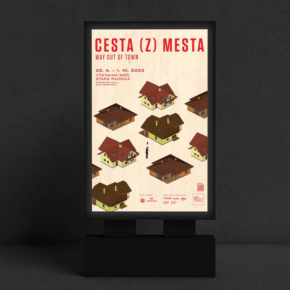
Way out of townProject type
Art-direction and consultingProject type

Fuud.skProject type
Greatest SlovakProject type
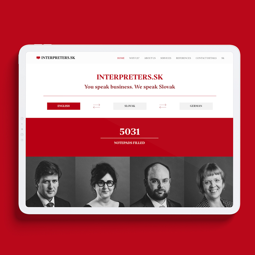
Interpreters.skProject type
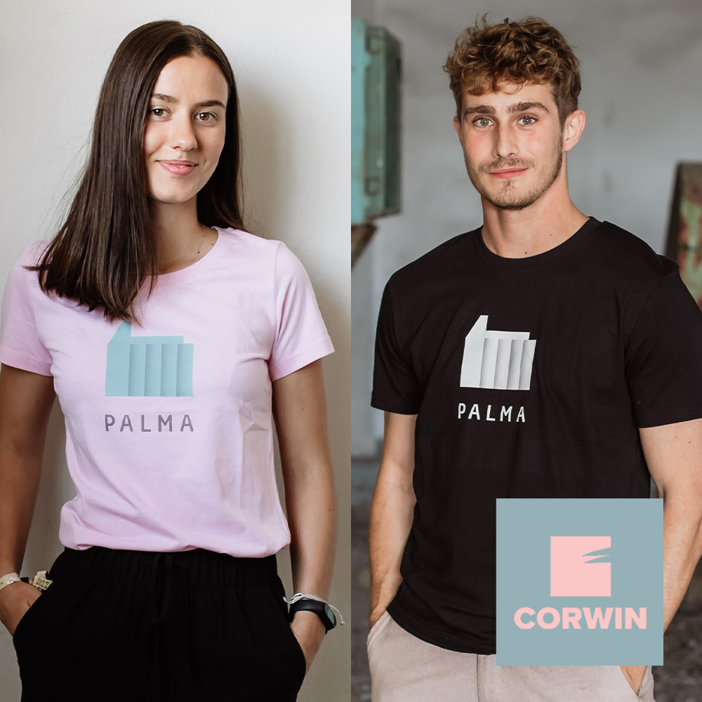
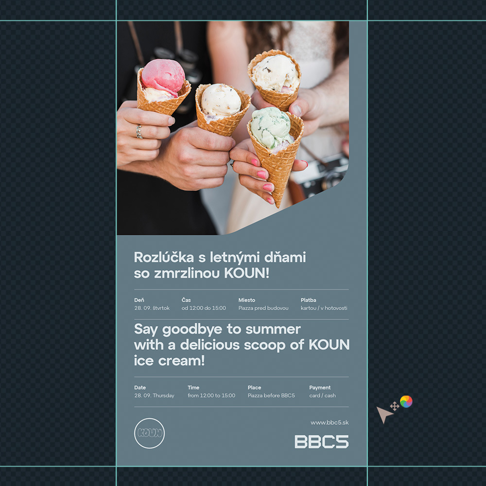
Merch.skProject type
Welz Eco LandProject type
Fit&CoProject type
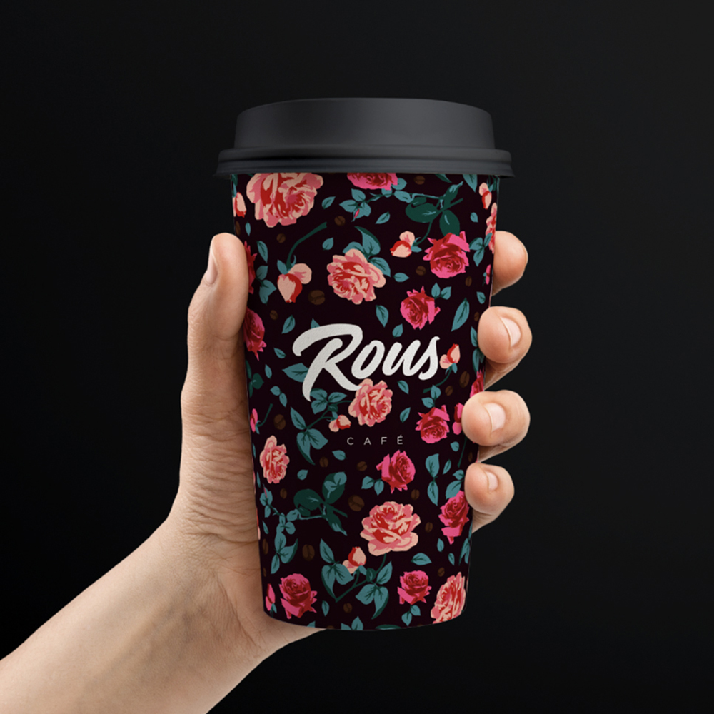
RousProject type
Creating better tomorowProject type

Grape FestivalProject type

Basketball Shooting ClubProject type

Café ReginaProject type
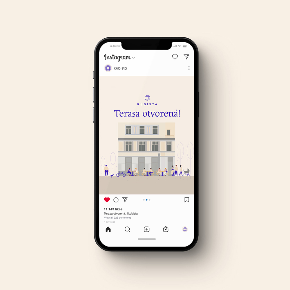
KubistaProject type
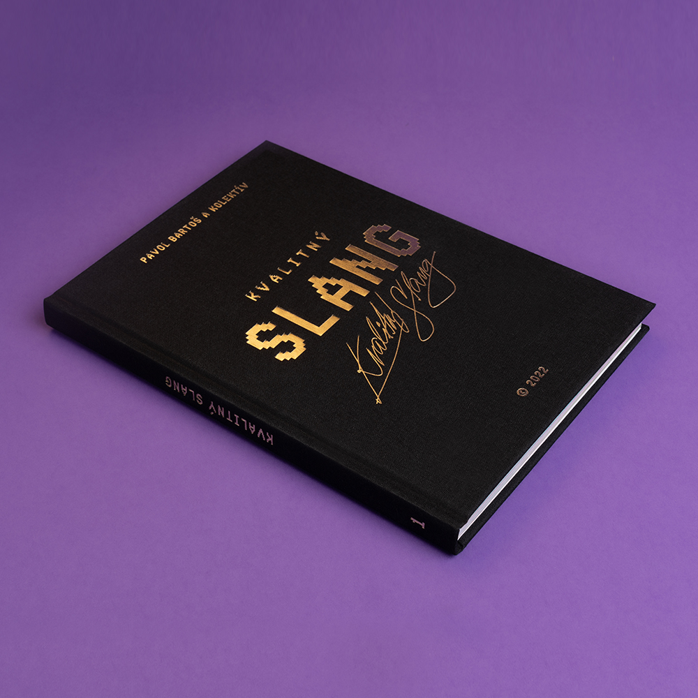
Slang BookProject type
Office:
Dunajská 4
81108 Bratislava
Slovakia
Billing:
Bratiska, s.r.o.
Klemensova 17
81109 Bratislava
Slovakia
VAT: SK2120035544
REG: 48077844
© BLESS STUDIO 2011 — 2024, VISUAL ARTWORKS AND ALL COMPONENTS ARE INTELECTUAL PROPERTY OF PAVOL BARTOŠ, BLESS STUDIO, BRATISKA, S.R.O. AND / OR RESPECTIVE OWNERS
